


14 Tips to Master the Art of Graphic Design
7 minuteRead

Every day, every minute, graphic designers create visual masterpieces that communicate ideas and are viewed all around the world. Designers work on various types of entertainment, advertising, news, and features, including print media, game machines, television, online browsers, social platforms, and portable devices. A graphic designer’s responsibilities and abilities expand in tandem with the sophistication of technology. With graphic design, you'll have a wide range of possibilities, even some that haven't even been developed yet in this day of rapid technological progress.
When you're starting out as a graphic designer, or even if you're a non-designer looking to learn some practical graphic design abilities, a solid collection of graphic design advice is always useful. Graphic design has several extremely simple concepts that, when implemented, may allow even the most inexperienced designers, or even non-designers, to create a good design. Training and following a graphic design career path is a significant investment in your future, so the first step is to ensure you're prepared. Here are some of the best tips to get you started with your graphic designing journey:
1. Get your Hierarchy Right
The relevance and order of parts within a composition are defined by hierarchy. It has an impact on how your audience sees your material. The order in which information is presented has a major influence on its comprehension, impact, and value. Hierarchy is a visual design theory that designers use to manipulate the following qualities to highlight the importance of each page/screen's contents:
Size: Users are more likely to notice bigger items.
Color: Vibrant colours tend to draw more attention than subdued colours.
Contrast: Colors that are dramatically contrasted are more eye-catching.
Alignment: Elements that are out of alignment stand out more than those that are aligned.
Repetition: Using the same style over and over again might indicate that the content is connected.
Proximity: Elements that are close together appear to be linked.
Whitespace: More space around elements draws the eye towards them.
Texture and Style: Richer textures stand out more than flat ones.
2. Plan out your Colour Scheme
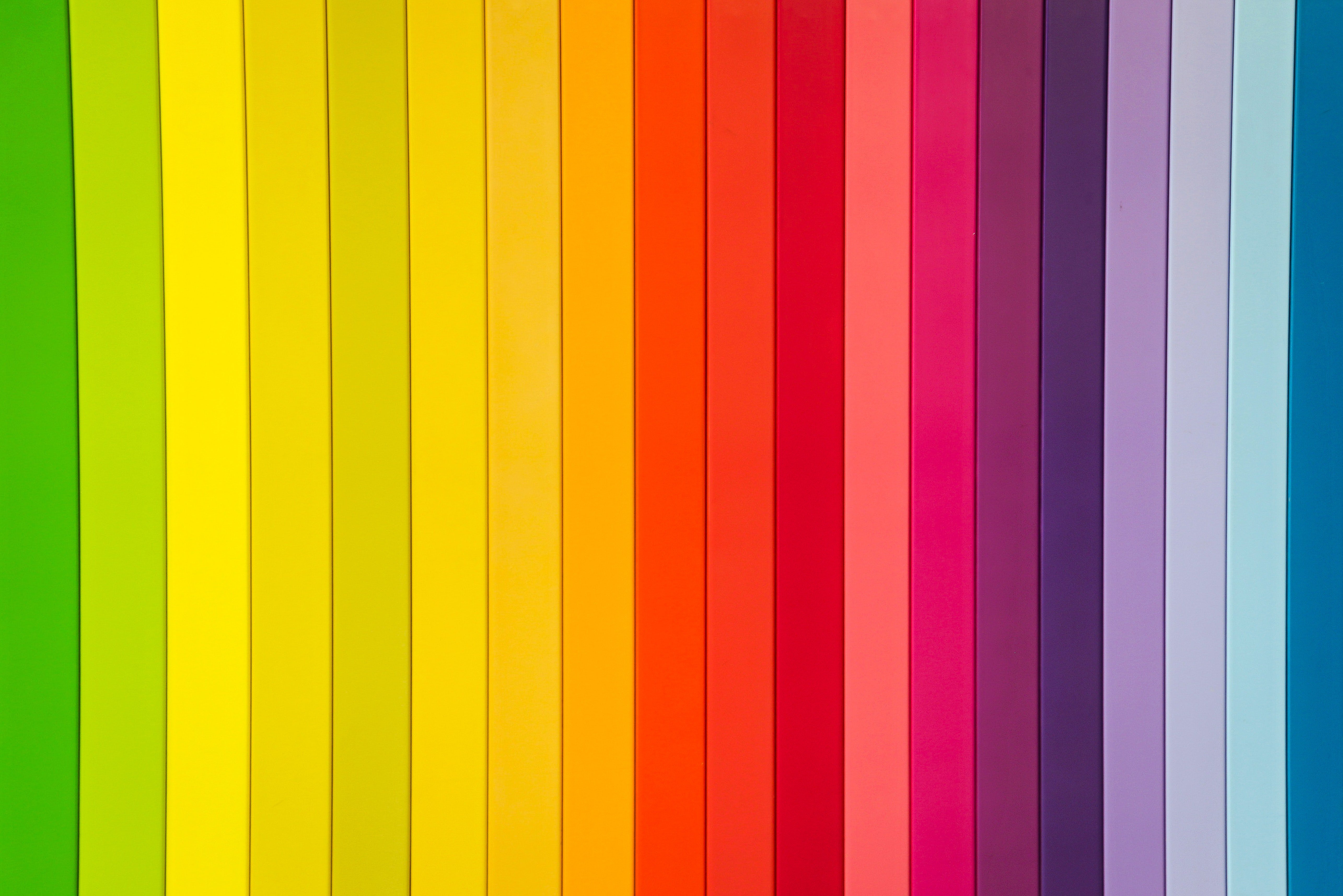
Colour schemes and palettes are just as essential as the message you wish to send via your design. When selecting a palette, it's vital to consider both colour psychology and colour theory. Starting with a colour palette of 1-3 primary colours that compliment one another and then utilising varying tones of the same hue for consistency by altering the relative brightness or saturation is a simple way to get started. This is critical for establishing sufficient contrast in your palette. Extraction of colours from an image is also a fantastic technique to create beautiful colour palettes.
3. Be careful with the Typography
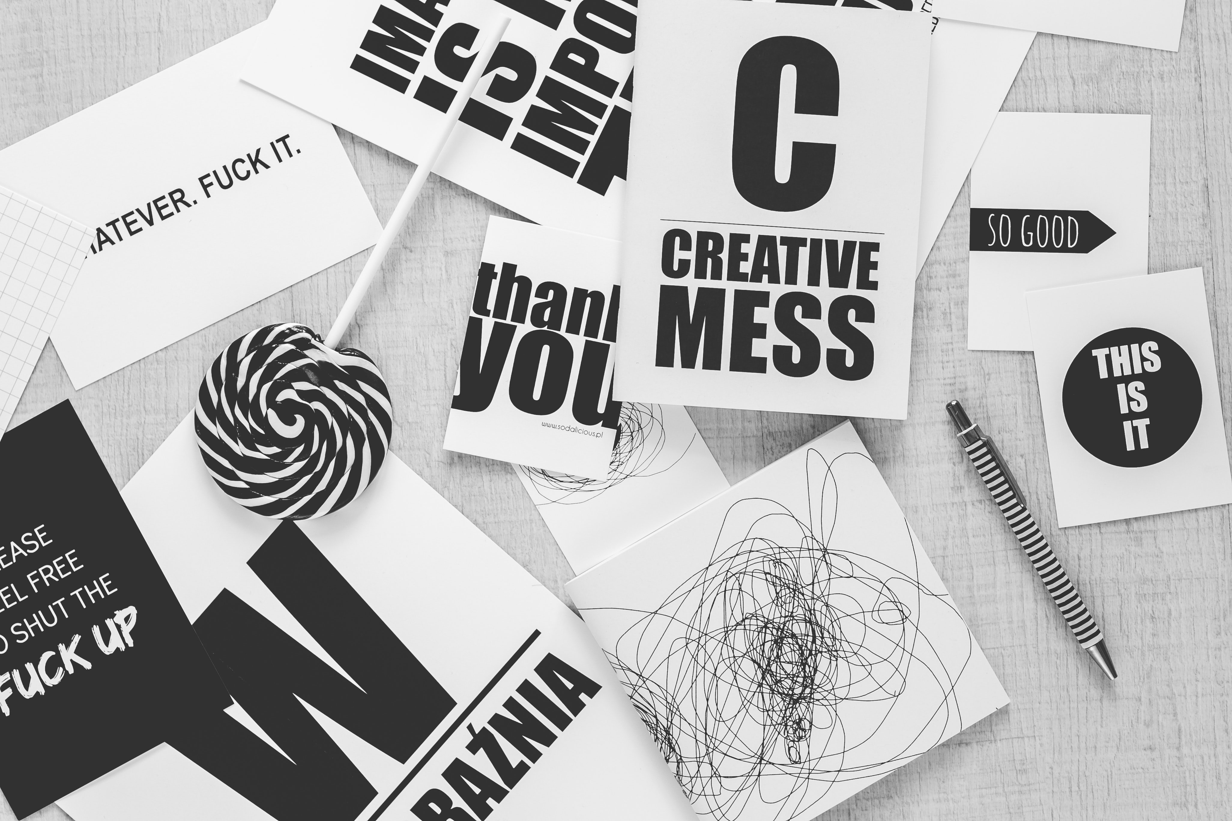
Typography gives your material a pleasing look while also preserving its aesthetic worth. It is crucial in establishing the overall tone of your design. For non-designers, the art of font selection has a poor name in the design industry. It's easy to become overwhelmed by the variety of typefaces accessible on the internet. When typography is utilised properly, it may elicit a variety of emotions and create an atmosphere, which can help to improve your company's branding. Letterforms are crucial in graphic design and, when used correctly, can be both elegant and aesthetically intriguing. If you want to build your pairings with different fonts, one simple tip to follow is to choose one novelty font for headers and a normal classic font for the rest of the text.
4. Less is More (Most of the time)

Clarity is one of the most crucial components of design, thus we must not trade readability for aesthetic appeal. Keeping things simple is the most essential design guideline for designers. Nothing is more frustrating than an overbearing, difficult-to-understand design. Make use of your inner minimalist to keep things simple. Keep the text and typefaces to a minimum, the colours under control, and the graphics balanced. The key to effective design is to avoid cramming your design with as many visuals and components as possible. It's striking a balance between visual appeal and simply and successfully communicating your message.
5. Whitespace is not your Enemy

Designers and clients may have issues with white space. The term "white space" refers to an area that is devoid of writing or other components. It's the section of the design that "breathes." This is one of the more difficult design methods to master than others. Design theory advocates the use of white space for beauty and providing a better user experience. White space is an excellent tool for balancing design components and better organising material in order to enhance the visual communication experience.
6. Make sure it’s Readable
Another good bit of advice is to make your content as simple to read as possible. This includes how you overlay text on backdrops, the colours and fonts you choose for headers, and how components interact with the text and design flow. Choose a typeface that not only complements your message but is also easy to read for your project. It must be simple to read against a backdrop image or texture.
7. Align to Perfection
In graphic design, alignment is critical because it allows you to organise components in a way that corresponds to how people naturally scan the page. It aids in the aesthetic attractiveness of your image by balancing it and establishes a visual link between similar objects. Maintaining the alignment of your elements, such as typography, pictures, and drawings, will guarantee a presentable design. Plus, you may utilise the alignment choices and instructions right in your Adobe programme to assist you. Make sure your page has margins all the way around it and utilise them to align your items.
8. Never stop Experimenting
Experimentation is crucial because it forces you to step outside of your comfort zone and allows you to accommodate the unexpected and unknown. You have complete freedom to think. Size and scale, relative brightness or darkness, colour, and the use of space may all be used to create a unique graphic design. Make sure the sizes of the components on the page contrast, and your colours are in contrasting tones or hues. You may experiment with the size of the type on the page, and it's also a good idea to think about contrast when matching fonts.
9. Use Icons to tell a Story

Icons may frequently express meaning faster and in less time than real words. They can assist to overcome language problems, call attention to a specific element of a design, and take up far less space while conveying the same message as written instructions. Because each phase can be graphically represented, icons are frequently utilised while illustrating a process. They aid in the visual comprehension of each stage of a process as well as the visual separation and comprehension of the parts they include.
10. Harmony in Design Elements
When you add design components to a project, they must all have the same look and feel. This holds true for all graphic elements, including icons, data widgets, illustrations, animations, and font styles. Squares with rounded edges should be mixed together with other curved components. Straight lines and straight angled forms.
11. Use Lines to your Advantage
Lines are used as a border around other design components or as a boundary between them to add flair, improve comprehension, create shapes, and divide space. Set moods, create textures, define forms, and build patterns with lines alone or in conjunction with other graphic design components. Simple lines are an effective way to help anchor items in a design and create the sense that there is an overall order and structure. You can use a line to separate a piece of content from the rest of the design and also to call attention to it. You can also use vertical and horizontal lines as “separators” between various elements in the image.
12. Consistency is Key
People might become confused and compositions can appear cluttered if design components, sizes, and colours are inconsistent. Set rules for the size and spacing of type components like headers, subtitles, and body content, then utilise Adobe's paragraph and character stylings to apply these rules to those text elements everywhere they appear. When it comes to producing balanced compositions, good spacing is one of the most crucial elements. Spaces can be found in the margins, between forms, paragraphs, lines, phrases, and even letters, and make your whole project look consistent throughout.
13. Stay Organised
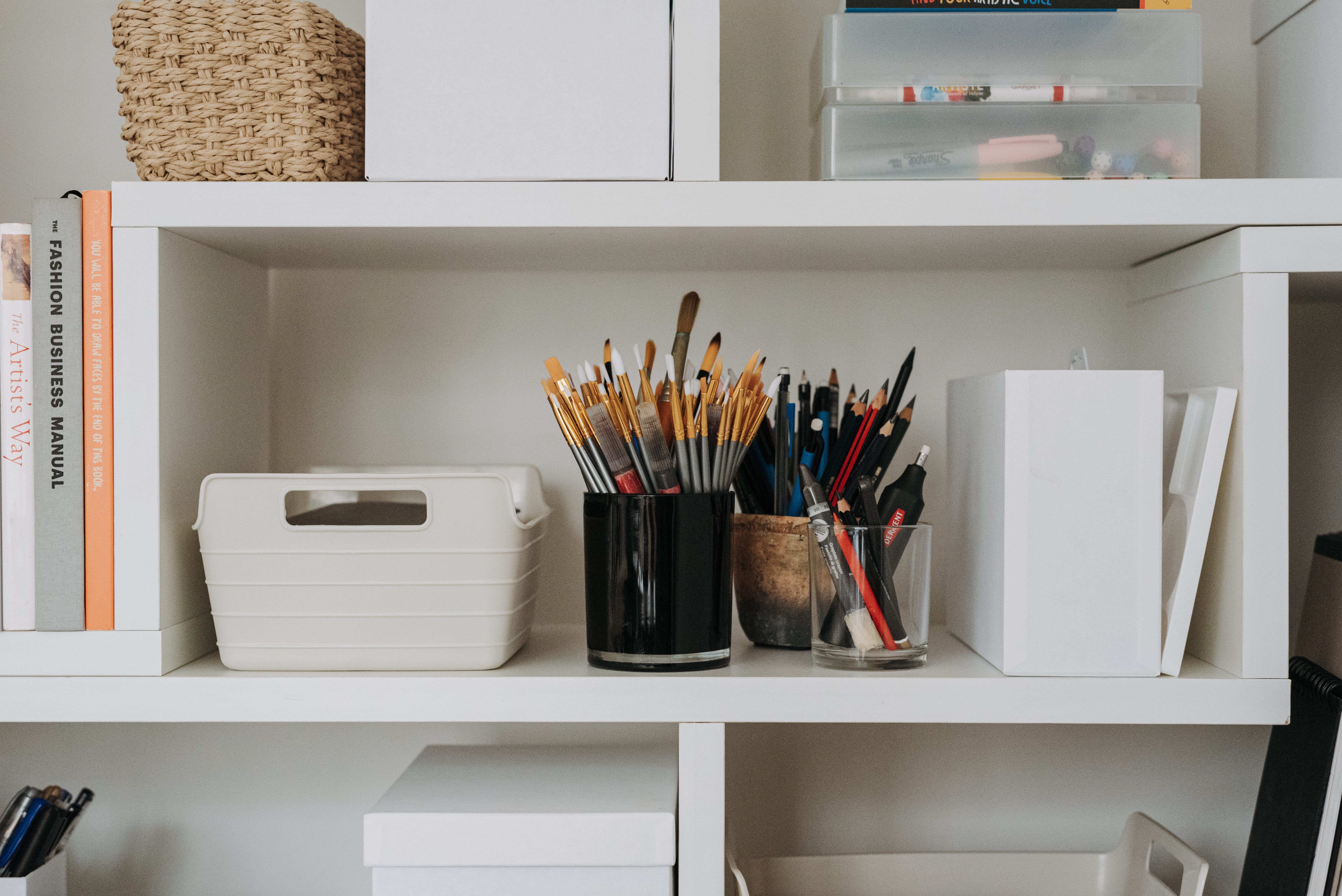
Designers must be organised in order to spend less time searching, researching, and looking for things and more time thinking, ideating, and producing. It's just as vital to be organised while designing as it is to pick the correct fonts and colours. You save time and can focus more on creativity when you have all of your materials ready to use. To make it simpler to identify the files, give them descriptive names. Make sure to create your project's primary folder and subfolders with asset kinds to make your design process more methodical and relaxing.
14. Plan out your Project
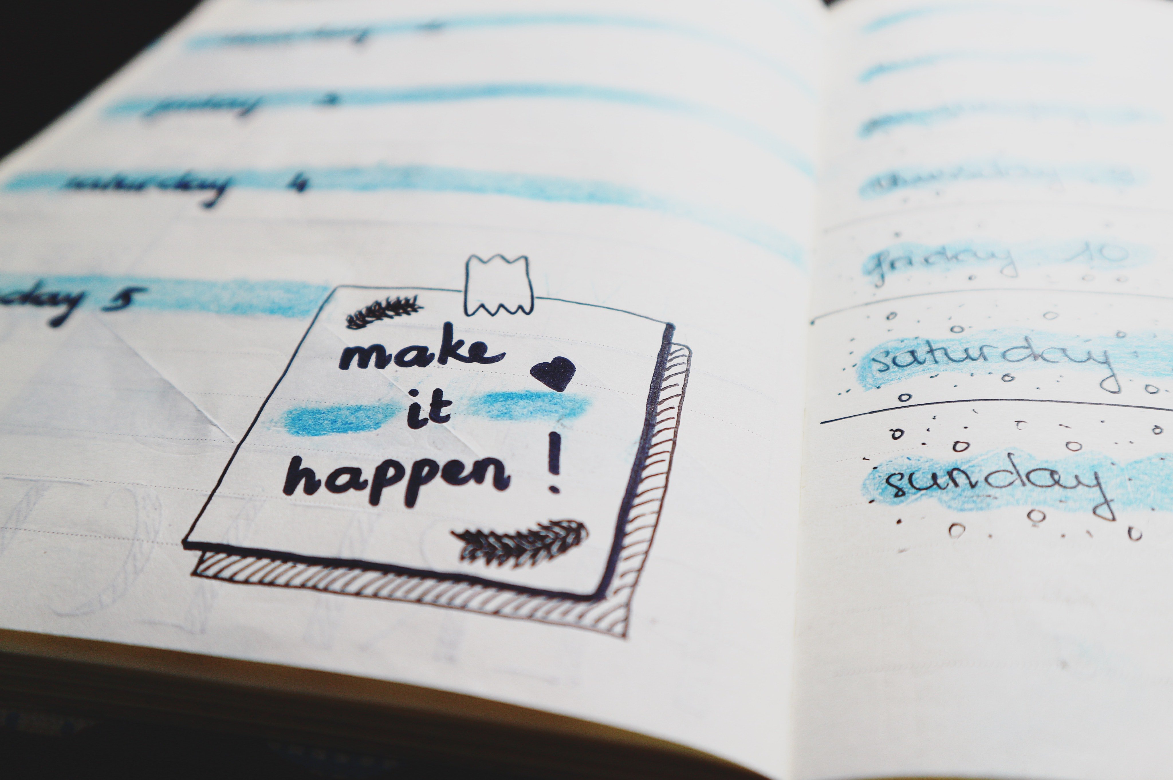
Planning ahead of time will result in fewer blunders and spare your customer from coming back to you because something was overlooked. It's critical to consider the design's goal, or what you want the audience to perceive and take away, before even touching a computer. Start with a few fast, basic sketches to lay out your page and where all of your material will go, and keep a moodboard handy to remain motivated.
Once you keep these tips in mind, your designing process is bound to become easier and more enjoyable for you. Keep working on mastering these skills to set yourself apart from the competition and make your mark in the graphic design industry!


Write, Record and Answer! Consume Unlimited Content! All you need to do is sign in and its absolutely free!
Continue with one click!!By signing up, you agree to our Terms and Conditions and Privacy Policy.